The Forum is about to leave "beta", and we want to collect one final round of feedback

We want to hear from you - yes, YOU.

As we approach the launch of the next generation of gaming, the team here at XboxEra have been working really hard on getting every thing we want to do ready. Now, whilst I’m not entirely ready to share what we’ve got cooking, one thing I can share is that we’ll be pulling our forums out of our extended beta period and into a more stable and live environment.

The forum has grown to over 1400 members and we’ve been incredibly humbled by how involved, passionate and frankly - talkative you lot are, as well as how quickly this place grew and how positive (generally) you all were about gaming and everything else. Our moderation team have been impressed with how quickly folks have acclimatised to this new software, as well as how quickly folks learned how to self moderate via our reporting functions. We hope you’ve found the moderation here open, fair and responsive.

While we’re not some massive media company with a significant budget, we do feel we’re out there providing something worthwhile to Xbox gamers, and frankly, all gamers (regardless of preferred platform) that is inclusive, easy to use and focused on positive intent.

Our Patreon has allowed us to invest in some additional capacity for our back-end, which means less wobbles (you may have experienced a few since we launched!) so a big thank you to those folks that honestly do make all of this possible.

Having said that…

As we move towards November, I’d like to know directly from our community what you like and what you don’t.

So, consider this thread one you can use for friendly and open discussion.

Let us know how you feel about things so far - we’re listening, and whilst I can’t promise direct feedback on every single post you might make, it’s all being read.

Thank you for being here, and making this so much fun.

Sik

5 Likes

Staying on topic though, I don’t think I have much to say regarding feedback. After getting used to Discourse it has been a joy to navigate through the forums and, most importantly, to create and customize threads. The available tutorials do wonders to help us aswell.

With that said, I do have to mention that I am not a fan of the homepage – especially the “latest” section at the right of the page. It is a very useful section, but I don’t think that it is visually pleasing. I don’t know if it is the bolded font size, or maybe everything coupled with the colored category squares and rounded tags – especially when the topic title is long and takes four lines.

All the information shown is useful and should not be removed, but I believe that they can be presented in a more pleasing, modern, “Microsoft-esque” format. Maybe in a way that more topics would fit in the layout, since it currently shows only five – two of tem being pinned ones.

I know design is not the most important thing when going out of beta, but as I said before, I don’t have any complaints about the forum itself, so it was the only real feedback I could give.

4 Likes

I love Discourse. I only wish the homepage data matched the data on the pages (sometimes older threads are displayed and newer ones aren’t).

Love the site. Thanks so much! :slight_smile:

1 Like

It took some time to get used to Discourse but it’s great. I still don’t understand everything hehe.

It would be nice if there was a post on the forums for every video/article posted on the mainsite, both to promote it and to get some discussion going. I guess there is comment sections on YT etc but that’s not the same…

Other than that, keep up the good work!

I did not even know the forum was in a beta phase because for me it all worked smoothly so far. Though I am still missing the page driven format :wink:

1 Like

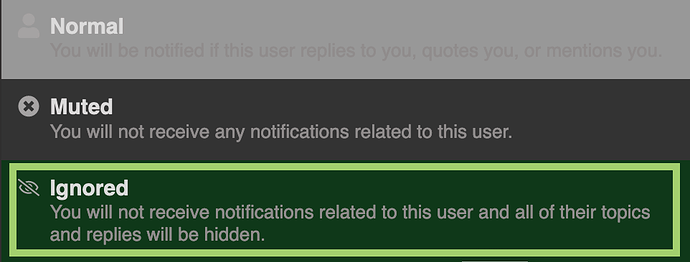
Could you make it so we can completely and utterly ignore people on here please.

I don’t want to see it when someone else quotes them.

The first page upon opening the site should be the ‘latest’ page!

I literally open the website as an app and then click on menu button to reach latest. Every single time by default.

Thank you :pray:

You can set Categories, Latest or Bookmarks as your default Home page, check here:

1 Like

Ah, I saw your thread about it the other day. Something we could improve, @Predrag ?

@FunkyOne

Did you try the Ignore feature?

You will need to visit profile of the member you want to mute/ignore and then change what you want to see from them.

I am happy with the software. Endless scrolling works for me personally and having it save where you were when you come back is helpful.

3 Likes
It’s just a little thing i find it weird
We have to press Enter twice to start a new line of text here
2 Likes

Overall, this site and forum is excellent.

My main issue/complaint would be when typing out a message to post and it does format the way I want it. Sometimes, I want to just make a list with a game on each line and can’t unless I put a dash mark or an asterisk.

Other than that, missing the Table of Contents in the Xbox OT for the first party studios would be the only other issue, even though it’s more of a minor inconvenience. Otherwise, no issues.

Keep up the amazing work!!! :smiley:

I wish that using Ctrl+F would work like it does on other sites instead of defaulting to serve as a search feature for posts in the thread. Sometimes I wanna search the page/replies and have the page jump to the portion of the post and be able to sorta cycle through them like on most sites.

I honestly dunno what else to offer as constructive critical feedback. That’s a tiny nitpick but that is truthfully all I got.

As for the good stuff, literally everything else I like a LOT. Discourse is really great so far and the features for smoothing out the user experience is AWESOME. Stuff like just copy/pasting an image directly into the message or dropping links and it generating the imagery and whatnot on its own is fantastic. It’s really been a pleasure to use the forums so far!

Wish I could be more constructive! lol

I’ve enjoyed my time here. Just one suggestion - any chance of an auto-banner insertion feature (perhaps based on the tags added?) when creating a new post?

1 Like

Yes, this is the way to make new line because we extended editor/composer features, and 1 x Enter needed to go (tbh I’m not sure why, but some smart people who created editor know the reason)

If you want the list format you need to add * or -.

For Search you will need to double press Ctrl+F to bring in browser search. And Ctrl+F is only hijacked when you are in topic that has 20+ posts/replies. Maybe in the future there will be an update that makes Ctrl+F option in user Preferences.

Interesting feature for sure! Would love to have it and make life a bit easier for members.

2 Likes

Yeah, I know. Wish I didn’t have to though. Sometimes I forget and when I post, the message looks all screwed up and I then have to edit it. LOL. No biggie.

1 Like

Not sure if it’s possible with this forum software, but I think pages are easier to navigate than the one long scrollable window.

1 Like