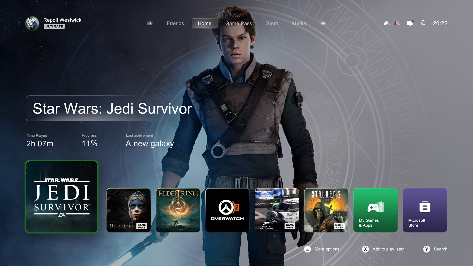
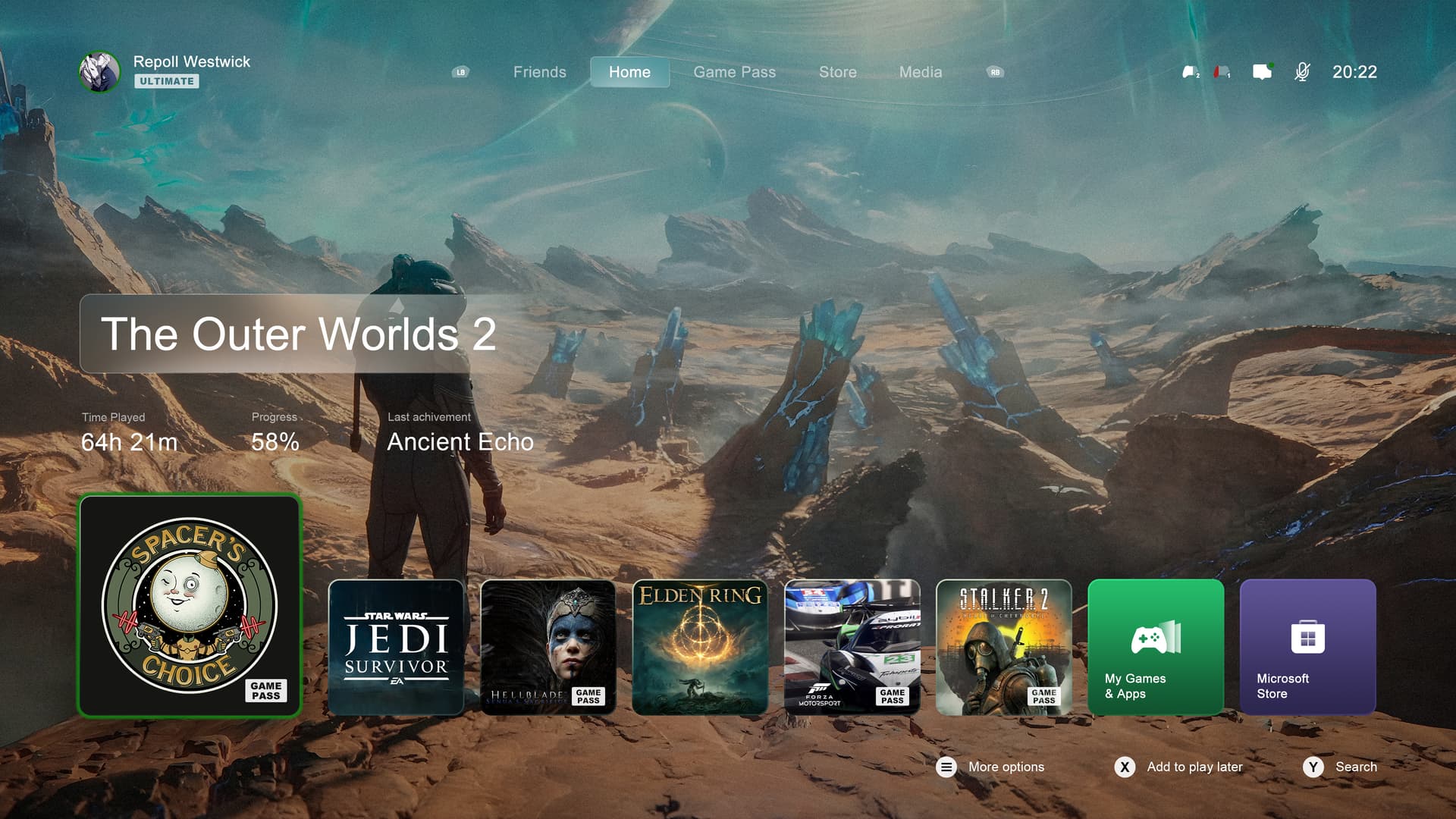
I really want Starfield and TOW2 now
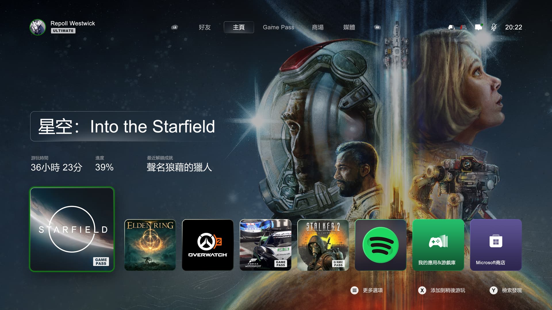
Looks great. Did you make there?
2 Likes
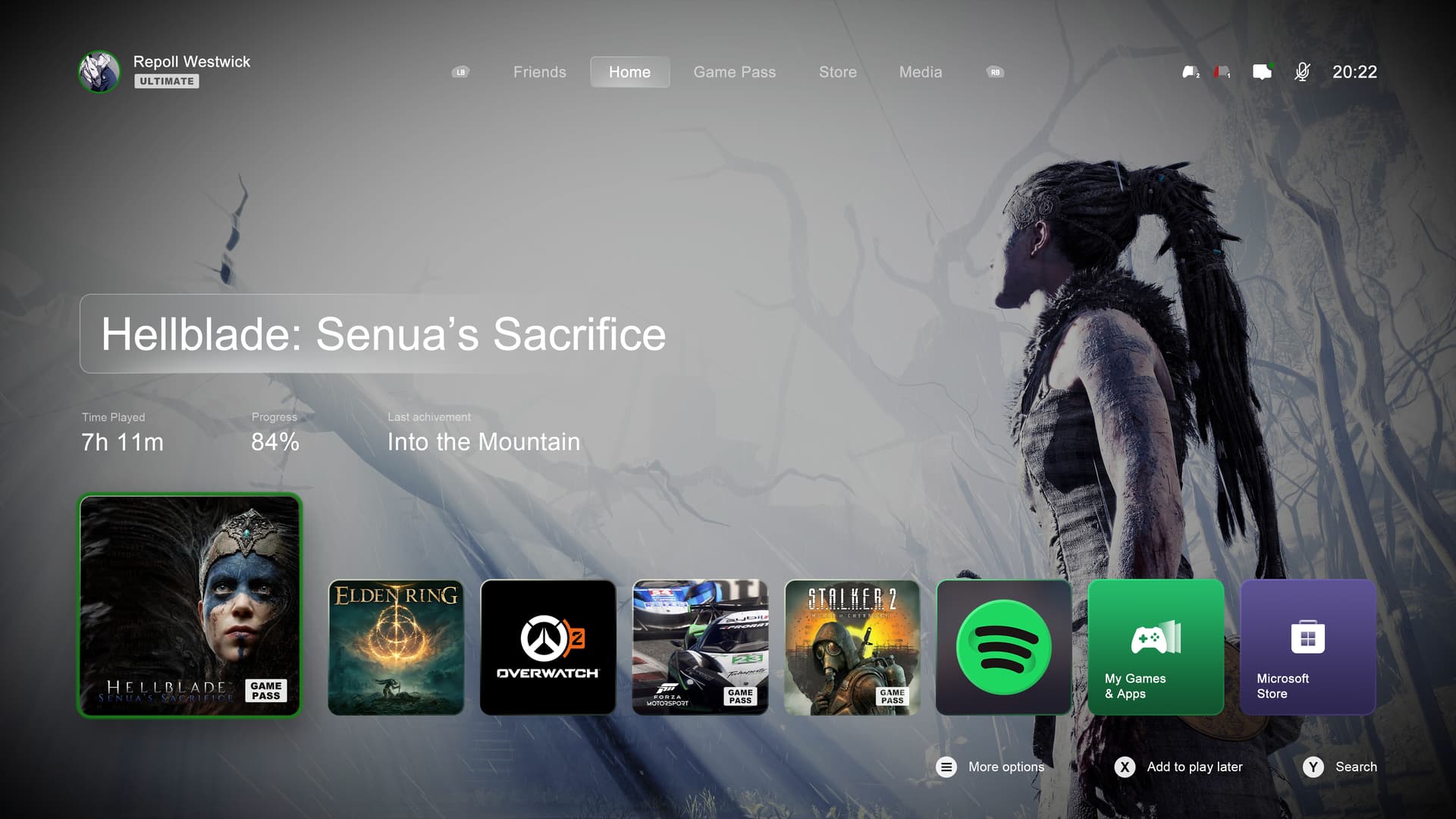
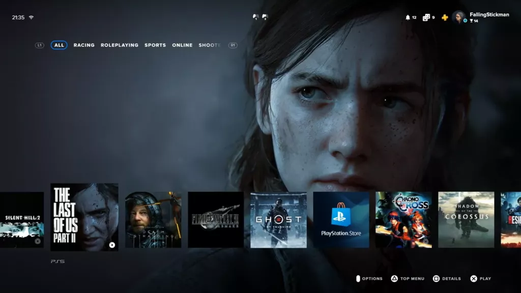
IMO this looks too similar to the PS UI, you just need to move the game tiles to the top.
In fact it reminds me of the rumoured PS UI before it launched:
I don’t know why people care so much about a homescreen. I spend like 1 minute tops on the homescreen everytime i turn on my Xbox.
A few reasons - first, I would like to see more of my dynamic background because if I can’t, what’s the point in me having one to begin with? Second, seeing tiles for settings, accessories, etc. is so damn ridiculous and shouldn’t be part of the tiles at all. Third, I would like to see the tiles be 8 across because each “big” tile is basically two “small” tiles. Give me 8 tiles on the bottom of the screen with the search bar and settings at the top being transparent so I can still see my background instead of a solid black box.
Like that Xbox dashboard a lot. Just need the eight small tiles instead of six small tiles and one big tile. Also, on top where it says Game Pass, etc., instead would prefer settings on the left, GAMES in the middle which would be the default when turning on the console and store to the right. This would be freaking perfect in my opinion.
OK, but like i said i barely spend any time at all on my Dashboard. When i turn my Xbox on is to play games, so who cares really about a homescreen as long as it works that all that matters.
How much time do you spend staring at the homescreen? What is the point of having a gaming console if you don’t play games?
Having a great looking home screen makes you even more enticed to play the games that are being shown via the tiles. If I see ads or all this other crap, not so much. Plus, I just think it’s stupid to see settings or accessories or store as a tile EVERY time I click into it.
Really? so seeing a square block image thingy makes you want to play the game more???
I find that to be really weird lol and the ads on Xbox homescreen are always related to games, like example it shows black friday sales and othe gaming related stuff that you usually forget about so you see the ad and check out the store. Otherwise if you don’t see it you might miss it entirely.
Absolutely. For example, when I highlight a game tile on PS5, the game’s music starts to play and the background changes to that game. At that point, it’s like, hell yeah, let’s play!!! It just gets you more hyped.
When connected online, the tiles can move up so the ads can be shown, fine. But I play off-line so to waste the entire bottom row with empty space and then the tiles cover up my Halo Infinite background, it’s simply annoying.
And I just realized that there is a time when im on my home screen for a while, it’s when im installing a game disc or downloading a game.
That highlight a game and the music plays been a thing on Playstation since the PS3 days. I never care for that it annoying really cause some of the music are so bad lol
It seem to me you want nothing but the background image showing. In that case might as well just remove all tiles and just have a background image and just game text titles kinda like this pic here lol
To me it looks horrible, might as well just be a desktop wallpaper at that point.
You can still play another game even when installing a game though so you don’t need to have it on the homescreen.
+1 for don’t really care about the Home Screen because I don’t spend time looking at it. I only install what I intend to play and I only turn it on to play something. Honestly it could just be a text list of installed games as far as I’m concerned.
1 Like
Yeah, it’s a functional thing for me. I don’t like load it up and let it sit in the background like it’s some art on my wall.
2 Likes
I’m just an old man and an IT guy. I just want to get to what I want to do as quickly as possible.
1 Like
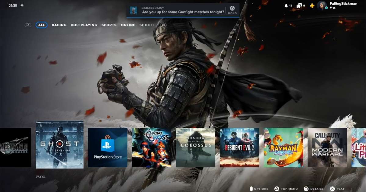
That’s NOT how the dashboard looks on PS5. Not even close. Those were just prototypes and they were bad. lol
1 Like
I have my lists/groups for games, apps, game pass stuff, etc. pinned there. And they are gone now with this new redesign and replaces with Microsofts ads which makes the new dashboard absolutely unusable for me.
2 Likes
I never used the dashboard main screen ever, always did everything with the Side Guide. Thats the only usable thing with this “new expeience”.
I provided quite the scathing feedback on this new dashboard even though I never used it. The lack of customization and ability to “make it your own” is amazingly bad. They need to take all this new stuff and put it as an Optional Section, then they can get meaningful feedback on what the new Game Pass sections provide. They would also get meaningful feedback on how many would enable or disable them being on the Dashboard.
The only thing I want on the dashboard is what I opt in for. Mostly my 7 different Pin Groups, Games with Gold section showing games to claim, then maybe a single tile to launch into full GamePass section but I can make do without that.
1 Like
Do you mean the Pin stuff on the homescreen? even though i don’t use it i just try pinning and it still works. Are you an Xbox insider? maybe that insider update cause it to be remove, but i heard they will add it back later in official new dashboard update.
I know, i’m just saying by how you sound when talking about the dashboard; it seem you want less and less stuff and just the background picture showing lol
No. He means the “custom folders” / “custom groups”. On the current dashboard experiment you can only pin 1 Group. If you pin a second group it replaces the group that’s pinned. It’s a huge step backwards.
2 Likes
I have no idea about that stuff. Never pin anything i usually just go to ‘my games and apps’ it all there for me.
Anyways hopefully they fix this with the official release.