I don’t consider this a “new” dashboard in the strict sense of the word, I think it is more like a refinement of what we already have. Don’t get me wrong, this doesn’t mean it isn’t good, I like what they are doing here. They could even push a bit further on Home/Front dash.
As for the reduced memory usage, I imagine they switched the UI framework for React Native, as they have done with the Store and the Xbox Windows 10 app…maybe? I have no knowledge to state this, I am just thinking it may be the case, but I’m really not sure, since the OS is based on Windows, after all.
They removed it from the guide in this new UI. I always used it to check achievements in my current game or check the leaderboard to see my position. The leaderboard is no longer there. In order to see all my achievements I have to go to the profile. I also check recent or next achievements. It’s handy to have it all in one place.
In reality checking achievements on Xbox is kind of crap. That’s why I use TrueAchievements. But instead of improving it, they are hiding it.
I really don’t understand why they don’t show us? What kind of marketing is this? We are in August and we still haven’t seen a game running on Series X!
I hope they’ll do some crazy stuff with the dashboard, like rumors say about PlayStation. I know it’s not possible now, because they want a reliable and unified experience, but in a year or two when they stop supporting xbox one.
I’m really digging the new look. Not revolutionary, but the current style doesn’t need to drastically change, it just needs to be more responsive and comfortable, and that seems to be happening. Loving the customizeable tiles and the animated backgrounds.
Tried it yesterday and I don’t think this is an improvement. More clicks needed to see the same amount of info, more loadings inbetween. Hope they tweak it because right now it’s not as comfortable as before.
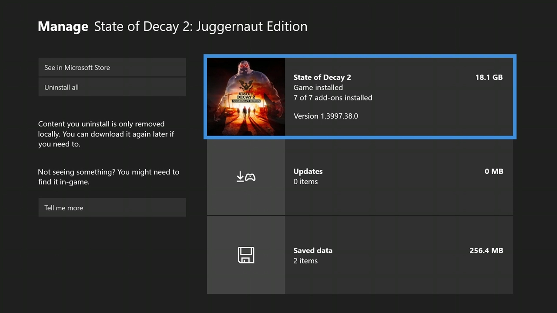
The new file management system is just awful. I hope they will change it but I’m pretty sure they won’t. I don’t know who had the idea that for deleting a game from your drive you have to unselect it and press “Save” to delete the file This is just plain stupid. Not even mentioning the extra button push they added for such a trivial operation…
Except this baffling decision, if they keep the same layout and speed as the new store, i think this will be a great update. And the geek in me welcomes the dynamic background.