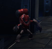
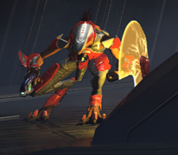
These Banished designs for the grunts and jackals look great, would love to see a Banished hunter too:
And the Brute Chopper is back!
These Banished designs for the grunts and jackals look great, would love to see a Banished hunter too:


And the Brute Chopper is back!

They so fixed the art design from last year. Last year looked to KIDDY. The joke was that it looked like a lego game. But the main thing was that it did not look like halo. But this does. They really nailed what makes halo… halo, and I love it.
As far as any issues with the graphics, I won’t worry until after seeing it in motion at e3. Even if it doesn’t impress it won’t be a huge deal. Halo 3 had the biggest letdown in graphics before this but it was the most loved. The environments especially indoors looked great.
That jackal looks so good, love the glow from the shield. People saying the characters don’t fit in well, it’s because of visibility, it is an FPS game that will have a competitive circuit, you want the players to see the enemies well in dark environments so that there is no advantage of playing certain spot and they have to keep the chracter design uniform throughout the game. People said the same thing about Valorant when it was revealed. All that matters in the end is the gameplay.
Holy shit this fucking game
Last year didn’t look like Halo? I thought the main positive of the gameplay demo from last year is that despite the graphical issues it finally retained the classic Halo artstyle.
? They redesigned the art to make it look more like halo. The main positive from last years demo was the gameplay and music.
The graphics where torn apart, including the art style which has received a massive overhaul.
That delay looking way worth it
https://mobile.twitter.com/ske7ch/status/1387915480355074050
That’s the community director acknowledging that it didn’t look like halo last year, from an art perspective.
Yeah, graphics were heavily criticized, but people were praising the art-style aside from a few minor complaints. It was praised for being more CE-like compared to 4 and 5’s vastly different art style. Elites being restored to their original look was also praised. Didn’t see anyone saying the art style wasn’t like Halo. It was the graphics being criticized, not the art style. The art style now is largely similar, just graphically improved.
That’s about the Sidekick pistol being redesigned, not the game as a whole.
Haven’t you been following the blogposts? Or the criticism? They even acknowledge the art style problems with original demo, and have talked about making it look more halo.
One of the major issues people had with the game was that it looked like a lego game and everything looked like plastic. that was about the art not about graphics.
You were saying it didn’t look like Halo. That’s not what people said, though. The general consensus was that the artstyle was a huge improvement over 4 and 5, returning to the classic Halo look. There were still some criticisms such as the plastic look of some materials, but the artstyle as a whole was praised, from what I saw.
It wasn’t praised. It was so-so. Many thought it looked overly cartoony, more so than halo 3 did. This was a big negative point. Which is doesn’t now because they changed the style to look more like halo reach.
The criticism that the material looked too plasticy was one of the main problems people had. 343 did that to have the simple look of halo CE. They changed it, and some other subtle things.
You should re-read the first blogpost they did on art/graphics. They overhauled the art due to Criticism.
I agree with that, there was a lot of criticism about the plastic look, and I personally agreed with those people. But no one was saying that it didn’t look like Halo. Despite the numerous problems, people were happy with the art style moving away from 4/5’s look.
New screen shots looking good. The environments are looking stunning. The enemies models are still a bit mixed though, some enemies still don’t have shadows and are looking to have low quality textures.
However, it’s still a WIP and will look much better in motion so can’t complain.
Even r/Halo is happy at the moment, so 343 must be doing something right.
Yeah, normally r/Halo is a very hard to satisfy bunch. So it is great to see.
I still don’t like the rock textures and the character models as you say still seem hit and miss, but I say again the game just seems to ooze atmosphere and they look to have done a good job with the forerunner design.
you’re looking at zoomed in images of the enemy models…
I’m not zooming in at all.
I’m not worried about that brute, it’s a screenshot and even on the most polished games like RDR2, a character in the background can appear blurry, expecially in dark places like this case. Or like TLOU2, sad Xbox console warriors posted on twitter stupid screenshot about the only non questionable thing in the gamem, the graphics.
I’m more worried about the overall look in a real gameplay condition, screenshots are good, but they are not the game itself.