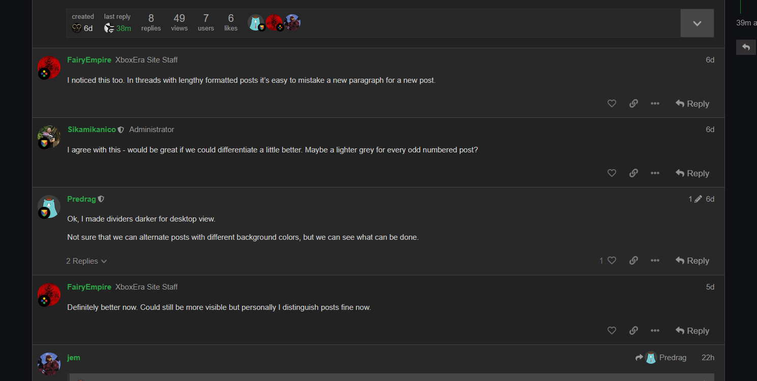
Hey, just some quick feedback. I noticed that in a thread it’s hard to make out the end of one post and the start of the other. The colour scheme is the same for all of the posts, and the only divide is a hard to see line that is in the centre between two posts.
This same problem is also at the end of a thread, where it’s hard to see where a thread ends and the rest of the site appears. Maybe some colour contrast could be used.
I do a lot of CSS tweaking for fun, it is possible to alternate post background colors…
I’m currently messing around with the CSS tweaking it to look like my custom ResetEra css. Here is the code to alternate post colors:
Edit: Pretty happy with it so far, only around an hour of work. It doesn’t work @ scale yet, as the timeline picker is broken the larger the window is since I’ve changed the forum to take up 85% of the screen rather than the tiny width it is set to by default.
I could potentially take a look at things although I will say I’m no professional or anything (entirely self-taught) and most of my tweaks I do for desktop view. A lot of what I’ve done for myself would have to be re-worked in order to scale to mobile screen sizes.
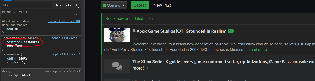
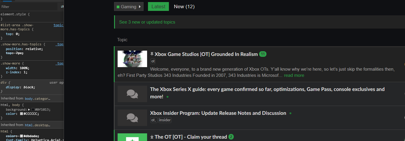
It’s not worth it’s own thread so I’m just gonna post it here. Found a small oversight with the CSS while mucking about.
When this class is set to absolute, it’s covering the headers above the thread list.
For sure we will keep this in mind! Out goal is first to go through any technical challenges during ‘soft launch’. After that we can focus on theming and further customization. Of course, all ideas or suggestions are welcome.